Friday, August 10, 2012

40 & Under

This month we're featuring a unique show in that the "theme" is strictly based on age rather than subject matter or style. "40 & Under" features eight artists who are forty years old and younger. Typically forty years old is considered "mid-career," so it's a fun opportunity to show artists who show great potential and are successful at what they do, but haven't hit their peak. However, I definitely would not characterize these artists as "emerging" as they have had a taste of success and continue to do so with their well-defined, unique styles.

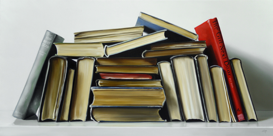
Part of the success of the show, I think, is these artists' ability to think outside the box by using innovative mediums partnered with their own spin on a conventional subject matter. For instance, Samantha Buller from Sebastabol, CA has contributed five landscapes to the show. While aspects of these pieces remain representational, Sam's work is propelled by the gestural accents used to define space. These chalk-like markings are made using an oil stick, allowing the artist to essentially draw with paint, bringing new dimension to the surface.


"Carmel By The Sea"  |  Oil on canvas  |  24 X 30


"Road From The Sea"  |  oil on canvas  |  24 X 24


Having recently switched mediums from plexiglass to resin, a viscous liquid that hardens permanently, Maren Conrad's latest series of work is without a doubt, her best yet. However, the medium alone cannot be credited with this success. The combination of Maren's ability to draw, the inclusion of gold and silver leaf, and her organic spatial organization transforms these pieces into multi-dimensional works that have an enticing depth. One cannot help but approach the work for closer inspection. 


"Duality"  |  Oil and acrylic on resin with gold leaf  |  48 X 48

Fish are the primary subjects of Maren's latest series of work. While talking to her I found out that she had made a trip to Bali in 2007 and visited a retreat that was inhabited by British cancer patients. A large koi pond occupied the property and became an integral component to the patients' experience. Water, of course, is said to have therapeutic and healing qualities and I imagine the Balinese culture contributed to this "zen-like" catharsis. Needless to say, the experience influenced Maren and her work as both subject matter and overall feeling permeate her new pieces. 

The combination of the medium and subject matter is purposeful and authentic. By the nature of resin, objects and in this case, drawings and gold leaf, are suspended between layers as fish are suspended in water. This level of thoughtfulness goes beyond simply painting a meaningful subject.  She has considered the subject in true form and has given life to her work by creating the pieces in a visually and logically compatible medium.  I honestly wouldn't have considered the connection between the nature of resin and the nature of fish, so I'm truly impressed by Maren's insightfulness. It elevates her work to a place many only hope to reach.


"Yin & Yang" diptych  |  Oil and acrylic on resin  |  48 X 24 each


On the subject of unique mediums, one cannot overlook the work of Bay Area artist Lisa Alonzo. Lisa's series "The Narcassist" feature none other than herself as the main subject. Each piece is carefully painted using a pastry tip normally used for decorating cakes. The effect of this extremely time-consuming process is magnificent and inspiring. My first impression of Lisa's work is that it's almost a modern take on pointillism, a technique that was used in the late 1800's, branching from Impressionism.  The technique is based on color theory and is successful because of the eye's ability to combine or blend small portions of color into fuller tones and ultimately, convincing form. Championed by Georges Seurat and Paul Signac, the technique brought new and innovative ways to capturing in "impression" of a subject. 

Arguably one of the best examples (if not the best) of pointilism is George Seurat's "A Sunday On La Grande Jatte":


While there are clear connections between pointillism and Lisa's work, there are several ways in which she has made it her own. One component of her work that I especially enjoy is the fact that she has left significant portions of the canvas void of any paint. Rather than applying white paint in rather mono-chromatic areas, she leaves them blank, allowing the multi-colored dots of paint create convincing structure. To me, this is a huge risk that is successfully and beautifully conceived. 


"The Coward  |  Acrylic and moulding paste on canvas  |  36 X 36


Style and technique also plays into the success of San Francisco artist Ryoko Tajiri's work. The use of color and varying tones is similarly implemented but in an uniquely fragmented way that helps build structure and form. Layers of paint, some opaque, others matte, come together to produce new tones, while also creating the illusion of space through light and shadow. This layering effect not only creates a sense of depth, but also contributes to a greater sense of dimensionality on the whole. Ryoko's figures are pared down, they lack small detail and succeed in the ability to use large planes to describe form. 


"Woman Reading"  |  Acrylic on canvas  |  48 X 36


Ryoko's knowledge of space and composition involves the viewer from the very top and very bottom of the canvas, to the far left and far right. While a considerable void fills almost a third of the upper portion of the canvas, it is just as purposeful and engaging as the figure itself. The void brings to mind the psyche of the figure, what she's thinking, and perhaps the affect of what she's reading. But, this space not stagnant. Ryoko has infused a sense of movement using the same layering effect used to essentially "build" a sense of space. While this void is rather airy in "Woman Reading" it produces the opposite effect in "Daydreaming II," below.


"Daydreaming II"  |  acrylic on canvas  |  48 X 36

As I mentioned above, Ryoko has a great sense of involving all part of the canvas. While some areas play strong roles, others are secondary, yet purposeful. The glint of red in the upper right corner is one of my favorite parts of "Daydreaming II." While the melancholic nature of the painting cannot be avoided, the red glint of light, maybe, provides a certain solace or resolve that the figure has yet to find. Regardless of whether the small red portion has any true meaning (I suppose that's up to the viewer to decide) it does play a crucial role in the composition, no matter how insignificant it might seem. 

- Michelle

"40 & Under" is on view through the end of August and can be found online at www.efgallery.com.

Friday, July 13, 2012

Christopher Stott Limited Edition Prints

We publish and produce Christopher Stott's limited edition prints and have a variety of options available. Some of his most popular prints include, "Good Times" and "Good Stories," which feature antique books.


To view Chris' prints, check out our website:


Chris' newest print is called "Inner Conflicts" and the details are below:

Inner Conflicts  |  Limited edition giclee on canvas
24" X 48"   |  18" X 36"  |  12" X 24"

The piece was featured in his latest exhibition at the gallery called "New Paintings, 2012." The piece was also featured in the exhibition catalog that was produced for the show:


Saturday, June 9, 2012

Jelaine Faunce: Color Therapy

Jelaine Faunce of Henderson, Nevada just sent us five new pieces! Her trompe l'oeil still lifes are always captivating with their exacting realism and interesting compositions. The pieces in her latest series, "Color Therapy," certainly stand up to their name as the color of each piece is equally as important as the subject rendered. For instance, in her piece, "Color Therapy: Purple & Blue," Jelaine uses varying hues of both colors construct a sense of realistic space by defining areas of light and shadow with differing tones.

"Color Therapy: Purple & Blue"  |  20" X 20"  |  Oil on canvas

One can't examine Jelaine's "Color Therapy" series without considering the method behind the name. Commonly known as "chromotherapy," the process is said to be an alternative to conventional healing techniques. Since I'm no expert in this, I tend to think Jelaine makes this reference to remind the viewer, just in case they hadn't noticed already, of the emotive connection between the piece, it's palette, and the viewer's mood. Blue is a relaxing color; it's serene and calming. Check out the other pieces from this series below:

"Color Therapy: Orange"  |  20" X 24"  |  Oil on canvas


"Color Therapy: Blue & Green"  |  18" X 18"  |  Oil on canvas 


"Color Therapy: Warm vs. Cool"  |  20" X 20"  |  Oil on canvas


Friday, June 1, 2012

EFG Grand Opening 6.9.12


We're very excited for the grand opening of our new space at 1831 P Street in Midtown, Sacramento. Please join us on June 9th from 6:00 to 9:00 PM to view our new space along with our latest show featuring Christopher Stott and other new work by EFG artists.


"Deluxe Model 5"  |  oil on canvas  |  20" X 30"


"Rotary Phone, Off The Hook II"  |  oil on canvas  |  16" X 24"


"The Boy Next Door, The Girl Next Door"  |  oil on canvas  |  18" X 36"


"What Next? Only The Stars Know II"  |  oil on canvas  |  24" X 24"


John Tarahteeff, Gale Hart, and Gary Pruner are new to EFG, check out their work below:


John Tarahteeff  |  "The Artifact"  |  acrylic on canvas  |  36" X 48"


Gale Hart  |  "We The..."  |  paint on panel  |  15" X 22"


Gary Pruner  |  "Mime"  |  oil on canvas  |  36" X 48"


New work by other EFG artists:


Terry Pappas  |  "Avila Sunrise"  |  oil on canvas  |  30" X 40"


John Karl Claes  |  "Peaceful"  |  oil on canvas  |  16" X 25"


Kathrine Lemke Waste  |  "Dahlia and Kimono"  |  watercolor  |  18" X 22.25"


Gregory Kondos  |  "Lake Tahoe, 2012"  |  18" X 21.5"


Kari Tirrell  |  "Game Over"  |  pastel  |  9" X 12"


Sandy Delehanty  |  "Crimson Cactus Flower"  |  oil on canvas  |  24" X 30"


Micah Crandall-Bear  |  "Postage"  |  Acrylic and modified oil on canvas  |  60" X 72"


Jennifer Balkan  |  "81 Degrees, Chance of Rain 20%"  |  oil on panel  |  36" X 30"


Maren Conrad  |  "Cement Swimmer"  |  resin, acrylic, metal leaf on wood panel  |  36" X 36"


Michael Hockenbury  |  "African Jewel"  |  oil on panel  |  4.74" X 4.75"


Wednesday, May 16, 2012

Leigh-Anne Eagerton: What I Light

We're also featuring new originals by still life artist Leigh-Anne Eagerton this month. Leigh-Anne's paintings combine bold palettes, unique compositions, and a graphic quality that is conceived through blocks of pure color. The title of the show, "What I Light" is derived from her focus on light and shadow. While many of the objects featured rest upon bright, clean surfaces, their reflections and shadows are created with a sense of artistic liberty. While convincing, these elements evoke a generalized sense of reality; they become abstractions, which contribute to patterning that is abundant in her work.

Needless to say, the combination of Leigh-Anne's style and content makes her work fun, uplifting, and captivating. Here are a few of my favorites:


Donuts  |  oil on canvas  |  18" X 24"


"Lavender, Tangerine"  |  oil on canvas  |  16" X 20"


"Melon and Apples"  |  oil on canvas  |  24" X 30"


"Pure Apple"  |  oil on canvas  |  24" X 30"


"Tangerines On Blue"  |  oil on canvas  |  16" X 20"

May 2012: Susan Hoehn "Beyond The Light"

We are very pleased to be featuring Susan Hoehn as one of two artists in this month's show. "Beyond The Light" features Hawaiian landscapes, views of San Francisco, and scenes from the Napa Valley. While Susan is known for her picturesque views of vineyards (with good reason, as you'll see below) the show confirms that she isn't limited by location. 

"View Of Russian Hill" | oil on canvas | 36" X 24"


"Road Of Red Vines" | oil on canvas | 30" X 40"


"Silverado Trail Sunset" | oil on canvas | 30" X 40"


"Palace Of Fine Arts" | oil on canvas | 36" X 36"


"Bonsai Pipeline" | oil on canvas | 24" X 24"


"Laguna Glow" | oil on canvas | 24" X 30"


"Lahaina Harbor" | oil on canvas | 24" X 30"


Wednesday, May 9, 2012

New Work By Micah Crandall-Bear

EFG artist Micah Crandall-Bear just brought us five brand new pieces. Micah's style continues to develop and so too does his current "Polaroid" series, which is typified by an abstract focal point set off by a bold, white border. These abstractions have taken on a representational quality, as landscape elements have found their way into his colorful, linear compositions. Check out the new work below:

 Ashen  |  acrylic and modified oil on canvas  |  20" X 17"


Cloudbreak  |  acrylic and modified oil on canvas  |  24" X 36"


 "Reservoir"  |  acrylic and modified oil on canvas  |  16" X 16"


"Setting"  |  acrylic and modified oil on canvas  |  16" X 16"


"Carmel Valley"  |  acrylic and modified oil on canvas  |  30" X 26"